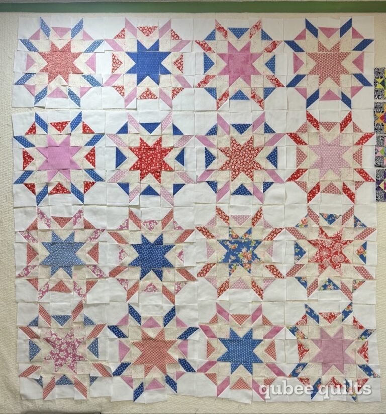
Let’s be entirely honest for a hot second: a lot of traditional quilt shops are stuck in a relentless, beige-tinted time loop. They’ve been peddling the same dusty farmhouse rules, Civil War reproductions, and safe, muted coordinate palettes since before the turn of the century. It’s predictable, it’s precious, and frankly, the world has enough beige. Now, I’ve watched shops evolve out of it. I’ve watched shops that were once on top of their game fade to nothing. I’m not sure the shops did it alone, though. The industry shifted. Modern found its footing in the 2000s, and we’ve landed in a happy medium. You’ve got folks completely tied to farmhouse on one hand — a crowd that’s shrinking. Folks completely modern on the other. Most people fall somewhere in the middle. The shops still stuck in 1994 never asked their customers what they actually want, never talked to them, never asked them questions. They let their pocketbooks do the talking — in lost sales. And if a new person comes in looking and you never see them again, that’s another telltale sign something needs to change. Rules were practically manufactured to be broken. Modern traditional quilting is all about slapping some serious visual friction into the familiar. Today, we’re taking a sweet, nostalgic collection and dragging it kicking and screaming into the current decade.
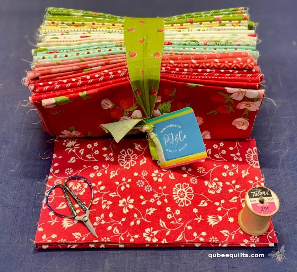
Here is how this design experiment actually happened. It started because I fell hard for the beautifully illustrated Bloomsberry fabric collection bundle by Camille Roskelley for Moda Fabrics. I loved everything about it and threw it in my cart on the online shelves at Plain Janes & Co.. But to hit my credit card threshold for that glorious six-months-no-interest financing, I needed to pad the total. Enter the traditional red vine coordinate from the Petals and Polka Dots collection by Bunny Hill Designs and a handful of high-saturation prints from my Ruby Star Society stash. I chose those extra fabrics solely because I liked them individually and couldn’t find anything else that sparked my interest. Full disclosure: I absolutely had no clue what architectural awakening waited when I opened the package. I was just standard impulse-buying fabric online at 3 AM before thinking, but if you’re going to break the rules, you might as well let your sleep-deprived subconscious handle the curation.
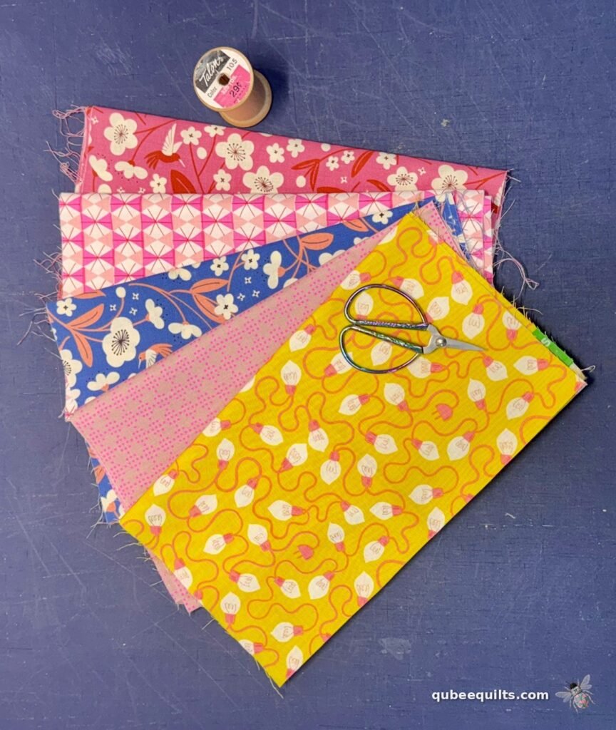
Now, if you look at these independent stacks on a retail shelf, your initial gut reaction is probably: absolutely not, these cannot possibly live in the same house, let alone the same block. On paper, it sounds like a design disaster. You’re trying to force cozy, vintage country porch-swing strawberries to play nice with ultra-modern, neon-adjacent, aggressively loud graphic prints. I didn’t think they’d work together either. But once I got them unboxed and threw them on my cutting counter, my brain just kinda clicked. I went, “Hey, wait… do these play together?” And then I realized—yes, they do. Oh my God, they played together.
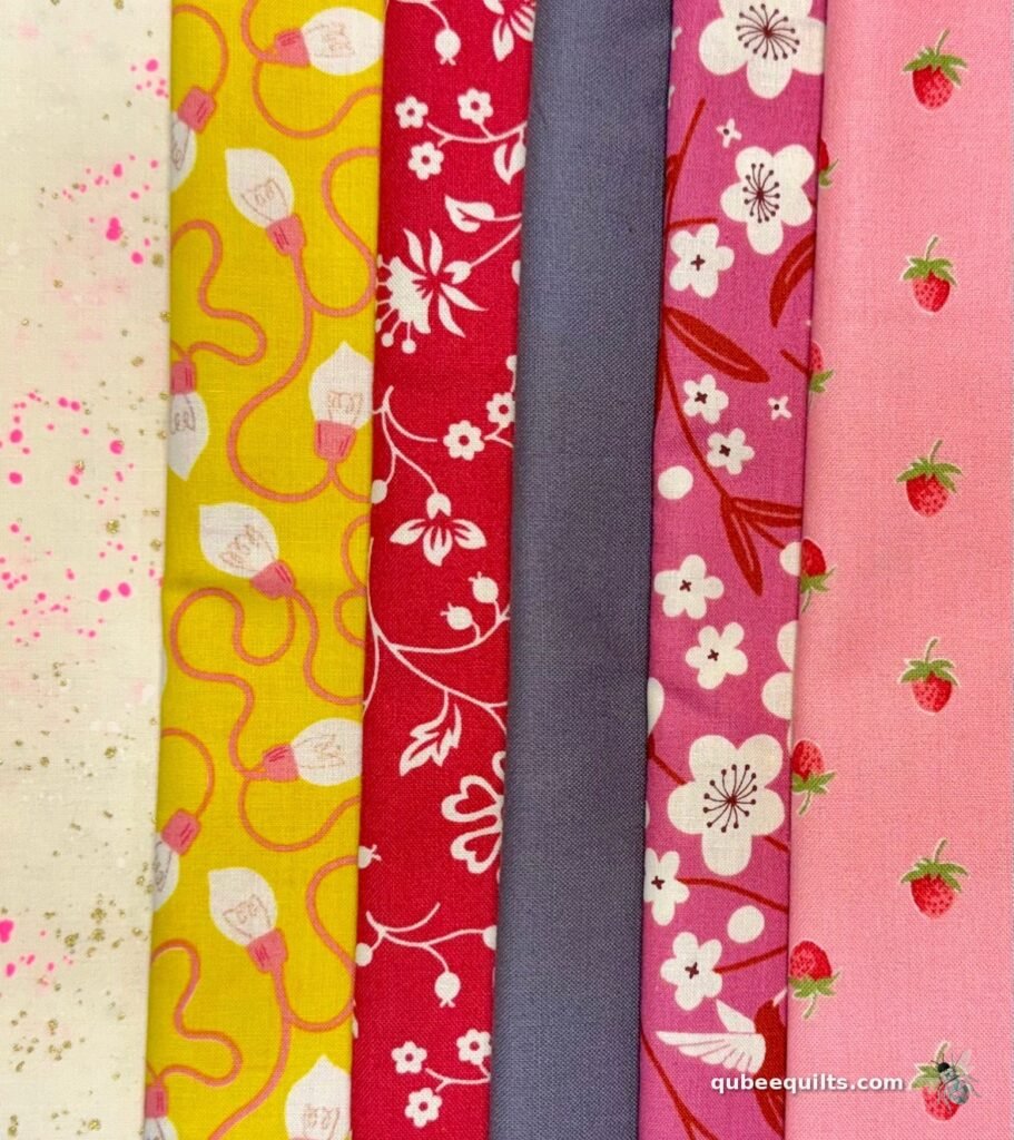
When it comes to mixing fabric styles that seemingly conflict, you have to look past the print themes and focus on layout architecture. Here is exactly why this accidental, sleep-deprived design alliance works, and why you need to stop playing it so damn safe with your stash:
1. Saturated Color Matches
The secret weapon bridging these completely different worlds isn’t subtle—it’s saturation. The background of those Bloomsberry strawberry prints isn’t some sleepy, washed-out pastel baby pink; it’s a rich, warm, unapologetic coral-pink. That exact undertone mirrors the deep orchid pink in our hyper-modern hummingbird prints. Because the color temperatures are equally loud and vibrant, your eye registers them as a cohesive family, even though the illustration styles are speaking entirely different languages.
2. High-Contrast Friction
Modern design lives and dies by unexpected, slightly uncomfortable combinations. Dropping a sharp, contemporary basic like our neon pink speckled metallic or those electric yellow lightbulbs right next to a traditional strawberry calico or that classic Bunny Hill red vine print instantly kills the “sweet grandma” vibe.
Fun fact about those electric yellow lightbulbs: it’s actually a Christmas print. But once you strip away the holiday context, the fabric gets to become its true self. Not all fabrics need to fit into one single box. The vintage prints give the block a curated, gritty character, while the recontextualized holiday print and neon coordinates keep it from looking like a kit you bought at a clearance sale in 1994.
3. The Pure Charcoal Silhouette
To tame this chaotic family reunion and make the fabrics actually play nice, you need a heavyweight referee. Enter a flat, premium solid charcoal background—no prints, no textures, just pure shadow. Think of it as a dramatic silhouette frame. The absolute second you slice these blocks together over a deep dark solid, everything changes.
Instead of setting your blocks on a predictable, all-over solid cream background, using charcoal completely flips the script. It forces the cream background inside that neon pink speckled print to jump out as a sharp, graphic accent shape. Who would have ever thought a basic cream could be turned totally upside down to become a high-energy, eye-catching, earth-shattering design element?
By breaking away from the standard grid and letting a dusky, modern solid do the heavy lifting, those sweet vintage strawberries transform into a custom, high-end design with some real teeth. Because at the end of the day, the world has enough beige.
So what unlikely pair is sitting in your stash right now — and what would happen if you put them together?